Design is often misunderstood as a purely aesthetic practice. In reality, premium design is the invisible bridge that connects a digital product emotionally with its user.
When a user lands on a digital product, they form a subconscious opinion of its authority and credibility in under 50 milliseconds. Generic layouts, cluttered boxes, and jarring motion design instantly signal a lack of care. Premium UI/UX, on the other hand, guides the user’s focus, reduces cognitive friction, and establishes immediate brand trust.
Cognitive Load and Spacing Systems
One of the most powerful tools in a designer's arsenal is negative space (or whitespace). Whitespace is not empty space; it is active spacing that allows the page elements to breathe. When layout items are cramped, the user's eye struggles to prioritize content, causing immediate fatigue.
"Whitespace is the cognitive buffer that allows the user's brain to process layout hierarchies effortlessly."
By establishing a strict mathematical spacing system (e.g. using an 8px grid token system), we ensure layout integrity across all screens. This consistency gives the design a structured, intentional feel that subconsciously signals quality.
Micro-Animations: The Magic of Feedback
Micro-animations are subtle motion cues triggered by user actions—a slight lift on a glass card hover, a smooth color transition on a button hover, or a fluid progress indicator. These details are highly effective because they satisfy the user's need for visual feedback. They confirm that the application is alive and responsive.
When designing premium motions, follow these rules:
- Keep it brief: Transitions should typically complete between 200ms and 300ms. Anything slower feels sluggish.
- Use natural easing: Avoid linear transitions. Use cubic-bezier formulas (like
cubic-bezier(0.4, 0, 0.2, 1)) to mimic natural physical acceleration. - Avoid motion overload: Do not animate elements for the sake of it. Motion should always serve to guide attention or confirm an action.
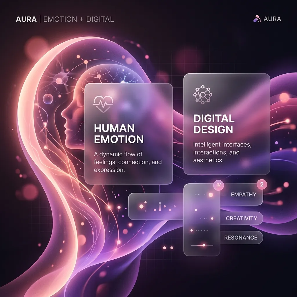
Emotion and the Visual Identity
Curating cohesive color systems, modern typography choices, and glassmorphic layers changes how users feel. Soft, ambient background glows combined with semi-transparent cards create depth and premium visual value. When design elements align perfectly, conversion becomes a natural byproduct of trust.